You approve a design on your laptop. It looks perfect. Then the print arrives and the blue has gone slightly grey, or the orange has lost its punch. Nobody made a mistake — your screen and the press are doing two completely different things.
Screens add light. Paper subtracts it.
This is the whole thing in one line, and once it clicks, everything else makes sense.
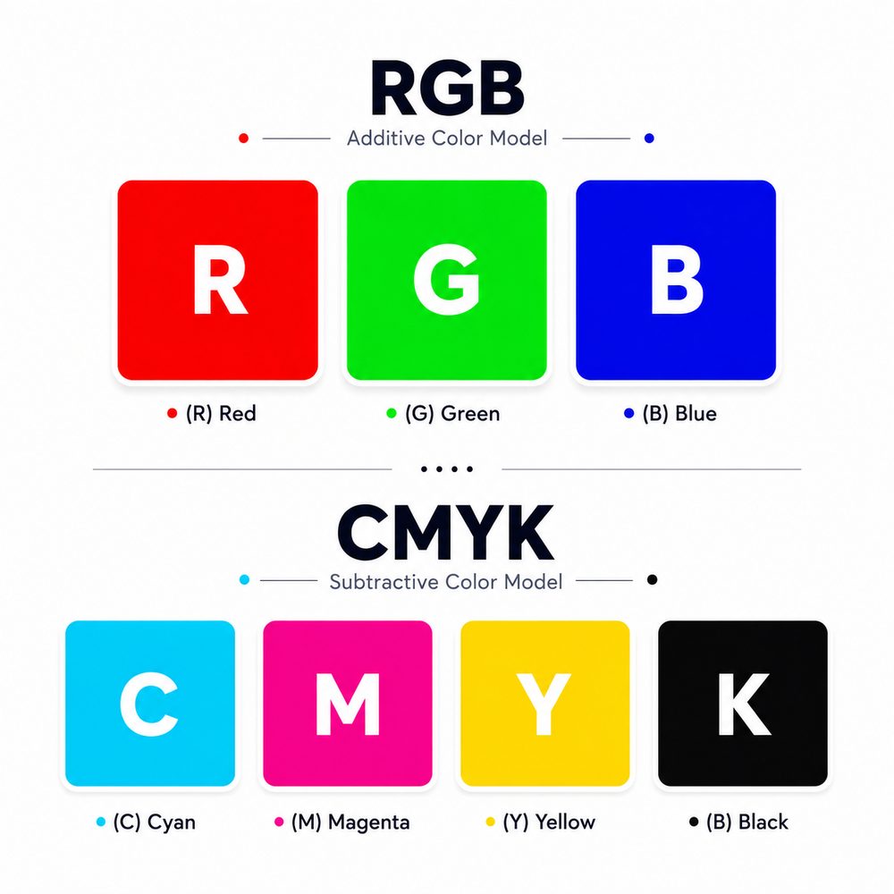
Your screen starts black and adds light. Red, green and blue light mixed together at full strength give you white. That is RGB. It is additive — the more you add, the brighter it gets.
Paper starts white and takes light away. Ink absorbs some wavelengths and reflects the rest, and what reflects back is the colour you see. That is CMYK — cyan, magenta, yellow and black. It is subtractive. The more ink you put down, the darker and duller it gets.
So a screen is a light source and a print is a light filter. They are not the same medium, and they never will be. Some colours a screen can produce simply cannot be mixed from four inks.
The practical consequence: bright, glowing colours — electric blues, neon greens, vivid oranges — will always look slightly flatter in print. That is physics, not a printing fault.
What the four inks actually do
Every full-colour print you have ever held was built from four inks laid down in tiny dots:
- C — Cyan. A clean sky blue.
- M — Magenta. A strong pink-red.
- Y — Yellow. Pure yellow.
- K — Black. Called K for “key”, because the black plate was traditionally the one everything else aligned to. It also avoids confusion with the B in RGB.
Mixing cyan, magenta and yellow at full strength should theoretically give black. In practice it gives a muddy dark brown, uses a lot of ink, and soaks the paper. So black gets its own ink.
The colours that cause the most trouble
Bright blue turning purple
The most common complaint in print. A vivid RGB blue sits outside what CMYK can reproduce, so the conversion pushes it toward the nearest achievable colour, which often reads purple. If your brand blue matters, avoid pure saturated blue in your artwork and specify a CMYK mix you have actually seen printed.
Flat black instead of deep black
If you set black as 100% K only, large areas come out looking grey and washed. For big solid blocks, printers use a rich black — black ink with cyan, magenta and yellow underneath it. A common mix is C60 M40 Y40 K100.
But use it only for large areas. Small text in rich black needs four inks to land in perfect register, and any tiny misalignment shows as coloured fringing. Body text should always be 100% K only.
Neon and fluorescent
Cannot be done in standard CMYK at all. If you genuinely need it, that is a special ink and a separate conversation.
A working palette
These are colours that reproduce reliably in CMYK. Values are given as CMYK for print and hex for screen, so you can specify either way.
| Name | CMYK | Hex | |
|---|---|---|---|
| Ink black | 60 / 40 / 40 / 100 | #0F0F0F | |
| Charcoal | 0 / 0 / 0 / 85 | #3A3A3A | |
| Mid grey | 0 / 0 / 0 / 50 | #8A8A8A | |
| Antique gold | 18 / 30 / 82 / 2 | #C9A84C | |
| Dark gold | 20 / 42 / 100 / 8 | #B8860B | |
| Forest green | 85 / 35 / 95 / 30 | #1A5C2A | |
| Leaf green | 78 / 18 / 90 / 4 | #2D8A46 | |
| Navy | 100 / 78 / 30 / 15 | #0B3D6B | |
| Corporate blue | 82 / 45 / 6 / 0 | #1F6FB2 | |
| Deep red | 25 / 95 / 90 / 25 | #7C1C1C | |
| Brick red | 15 / 90 / 88 / 5 | #C0392B | |
| Burnt orange | 5 / 75 / 100 / 0 | #D35400 | |
| Plum | 65 / 88 / 10 / 2 | #6C3483 | |
| Teal | 85 / 30 / 45 / 8 | #0E7C7B | |
| Cream | 4 / 5 / 12 / 0 | #F0EBE0 | |
| Off white | 2 / 2 / 5 / 0 | #FAF7F0 |
Note the swatches above are rendered on a screen, so they are RGB approximations. They tell you roughly what to expect, not exactly. Which brings us to the only reliable method.
If a colour genuinely matters — a brand colour, a logo — ask for a printed proof and judge it on paper, under normal daylight. Never sign off a critical colour from a screen.
What about Pantone?
Pantone is a system of pre-mixed inks, each with a number. Instead of building a colour from four inks, the press uses one ink mixed to that exact recipe. It gives consistency across jobs, across printers and across years.
It also costs more, because it is a separate ink and often a separate press run. It is worth it when a brand colour must be identical on every item across a long period — think of the big brands whose red or blue you would recognise anywhere. For most small business printing, a well-specified CMYK mix and a proof is enough.
How to prepare files so colours behave
- Design in CMYK from the start. Converting at the end is where nasty surprises happen.
- Send CMYK files. If you send RGB, someone converts it — and you will not be in the room when they do.
- Specify brand colours in CMYK values, not just “our blue”.
- Body text 100% K only. Never rich black for small type.
- Large solid blacks: use rich black. Ask your printer for their preferred mix.
- Do not judge colour on a phone screen. Phones boost saturation heavily.
- Ask for a proof on the actual stock. Colour sits differently on matte, gloss and uncoated paper.
One thing worth accepting
Colour will never match your screen exactly. Two different screens will not even match each other. What you can get is colour that is consistent, predictable and close — and consistent matters far more than perfect. A brand colour that comes out the same on every job you ever print is worth more than one that is briefly exact and then drifts.
The way to get consistency is boring but reliable: specify in CMYK, print a proof, keep the proof, and give it to your printer next time. For more on preparing files properly, see our business card paper guide and our guide to printing costs.
Common questions
What is the difference between CMYK and RGB?
RGB is additive colour made from light and is used by screens, starting from black and adding light to reach white. CMYK is subtractive colour made from ink on paper, starting from white and absorbing light. Printing uses CMYK, so screen colours must be converted.
Why does my blue print as purple?
Bright saturated blue in RGB sits outside the range CMYK ink can reproduce. During conversion it shifts toward the nearest achievable colour, which often reads purple. Specify a CMYK blue you have seen printed rather than picking a vivid screen blue.
What is rich black and when should I use it?
Rich black is black ink printed over cyan, magenta and yellow to produce a deeper solid. A common mix is C60 M40 Y40 K100. Use it for large solid areas only. Small text should be 100 percent K alone, or misregistration causes coloured fringing.
Do I need Pantone colours?
Only if a brand colour must be identical across many jobs over a long period. Pantone uses pre-mixed ink for exact consistency but costs more. For most small business printing, a specified CMYK mix plus a printed proof is sufficient.
Why does the same file look different on different paper?
Ink behaves differently depending on the stock. Coated gloss paper holds ink on the surface and looks more vivid. Uncoated paper absorbs ink and looks softer and slightly darker. Always proof on the stock you intend to use.
Can printers match the colour on my phone screen?
No, and no printer can. Phone screens are backlit and boost saturation heavily. Print reflects ambient light. Judge colour from a printed proof under normal daylight instead.
Need a quote for your job?
Send us the details and we’ll come back with a firm price, no obligation.
WhatsApp Us Request a Quote